: THE COMMITTEE
Delivering Omaha's promise of famous steaks with the story of an off-the-record members club.
A return to the culinary art and tradition of the Midwest chophouse.
The Committee is a contemporary chophouse inside Omaha’s historic Cottonwood Hotel, rooted in the story of a once-private gathering that shaped the hotel’s past.
From 1920 to 1935, hotel leaders met weekly over poker and shared meals. Within that group, decisions were made, recipes exchanged, and a culture of camaraderie formed. That history became the foundation for a brand that feels familiar, confident, and grounded in tradition.
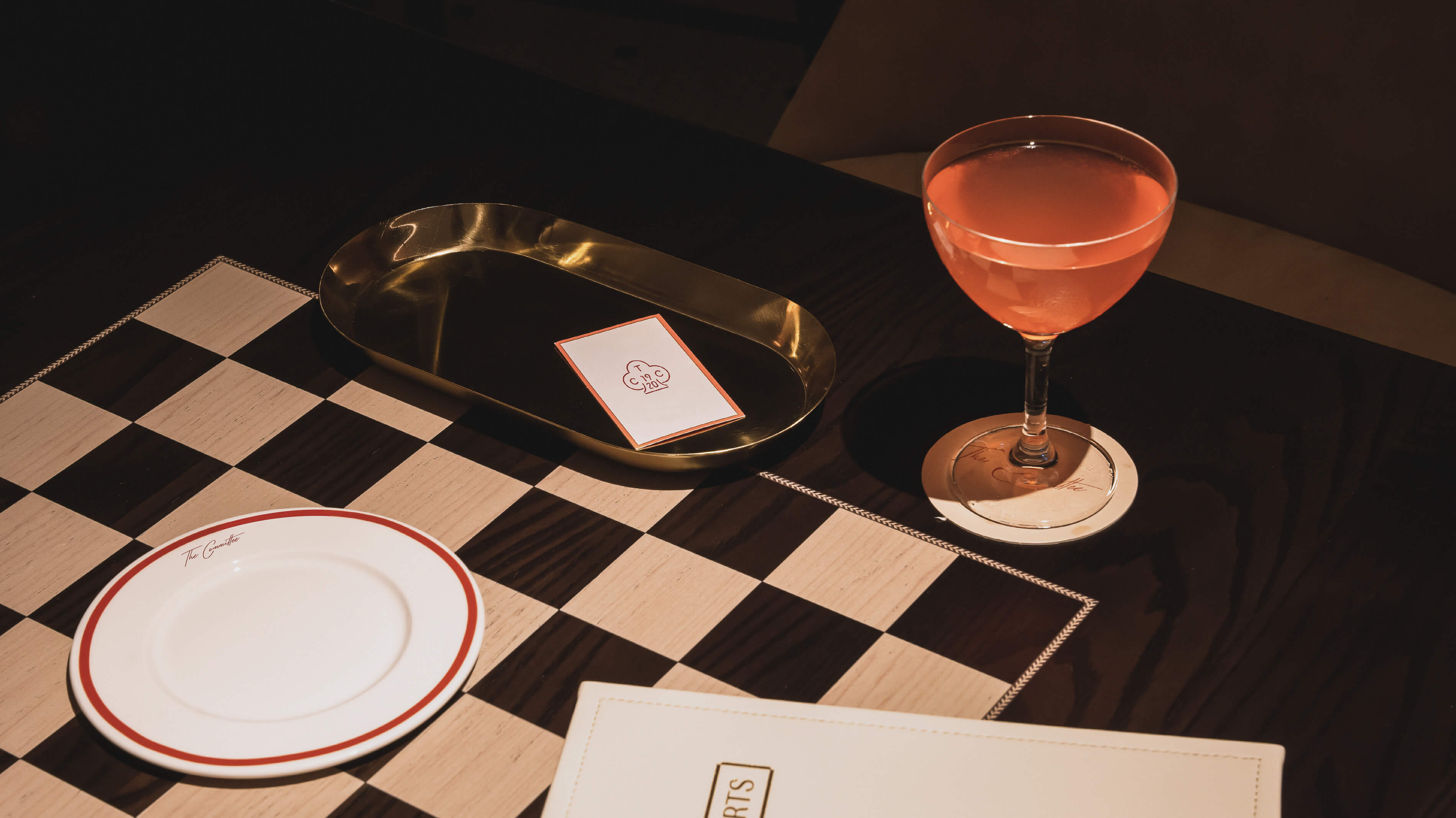
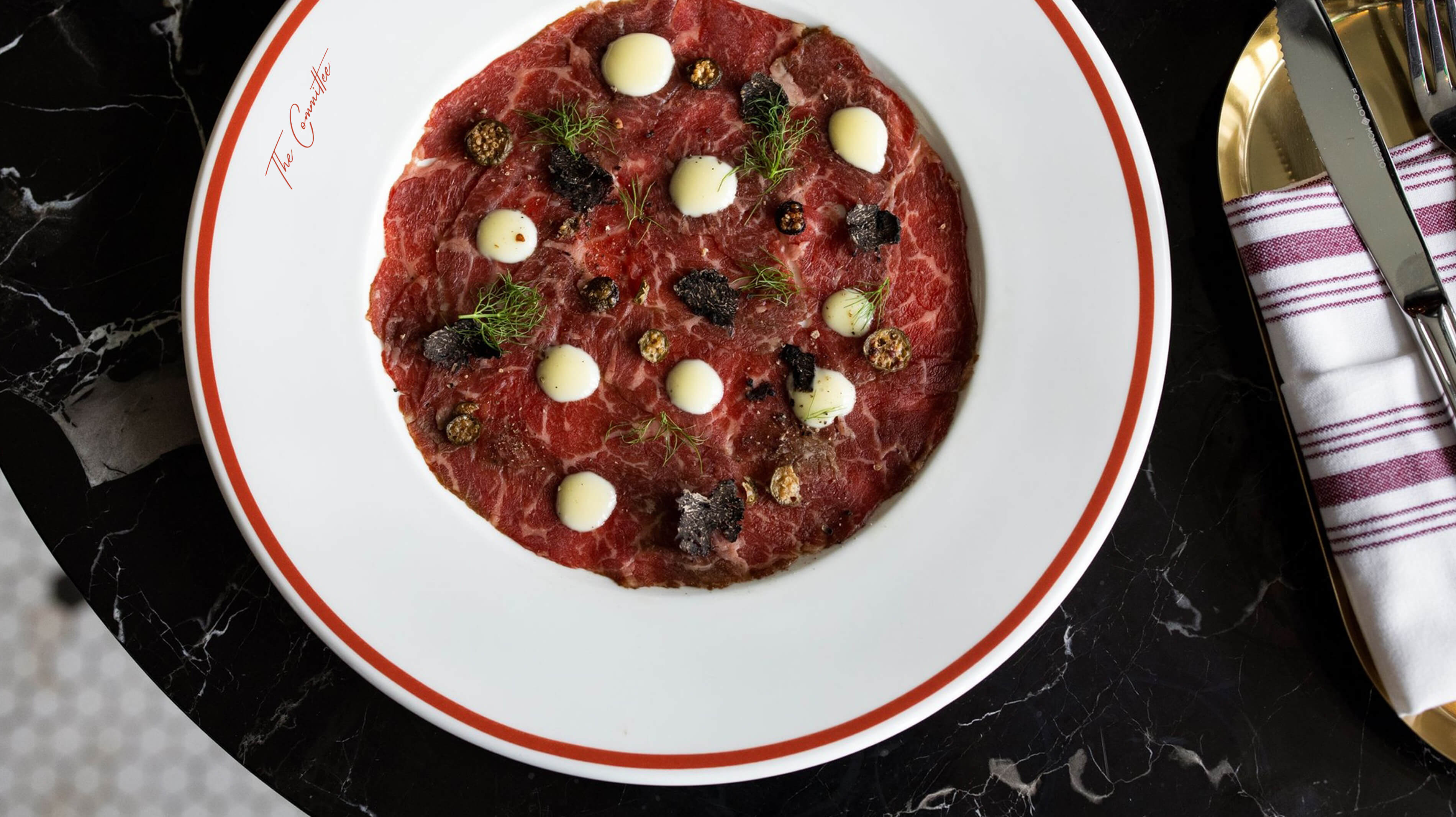
The visual identity connects the present with the past through tactile, character-driven design. A handwritten wordmark acts as the restaurant’s signature—personal, informal, and distinct. Supporting elements reference period design through custom illustrations, playful typography, and a color system built to live naturally within the space.
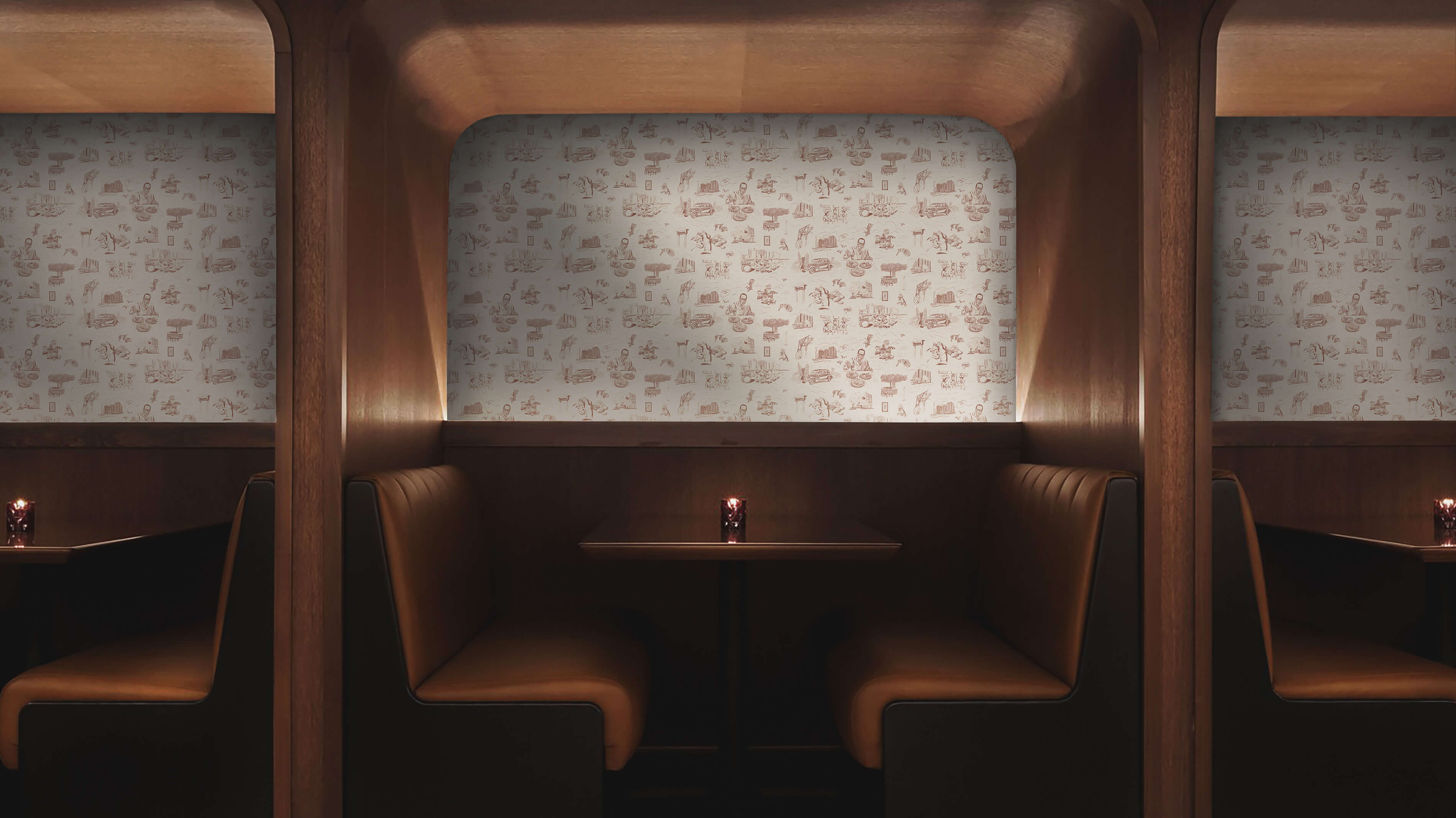
Details carry meaning: poker suits serve as staff insignia, menus balance old-world structure with character, and a custom toile wallpaper retells the original Committee’s lore through scenes from Omaha’s history.
ROLE
– Creative Lead
TASK
– Branding
– Illustration
– Collateral Design
CREDITS
– Completed with ︎OMFGCO
The Committee is a contemporary chophouse inside Omaha’s historic Cottonwood Hotel, rooted in the story of a once-private gathering that shaped the hotel’s past.
From 1920 to 1935, hotel leaders met weekly over poker and shared meals. Within that group, decisions were made, recipes exchanged, and a culture of camaraderie formed. That history became the foundation for a brand that feels familiar, confident, and grounded in tradition.
The visual identity connects the present with the past through tactile, character-driven design. A handwritten wordmark acts as the restaurant’s signature—personal, informal, and distinct. Supporting elements reference period design through custom illustrations, playful typography, and a color system built to live naturally within the space.
Details carry meaning: poker suits serve as staff insignia, menus balance old-world structure with character, and a custom toile wallpaper retells the original Committee’s lore through scenes from Omaha’s history.
ROLE
– Creative Lead
TASK
– Branding
– Illustration
– Collateral Design
CREDITS
– Completed with ︎OMFGCO


Delivering Omaha's promise of famous steaks with the story of an off-the-record members club.
A return to the culinary art and tradition of the Midwest chophouse.
The Committee is a contemporary chophouse inside Omaha’s historic Cottonwood Hotel, rooted in the story of a once-private gathering that shaped the hotel’s past.
From 1920 to 1935, hotel leaders met weekly over poker and shared meals. Within that group, decisions were made, recipes exchanged, and a culture of camaraderie formed. That history became the foundation for a brand that feels familiar, confident, and grounded in tradition.
The visual identity connects the present with the past through tactile, character-driven design. A handwritten wordmark acts as the restaurant’s signature—personal, informal, and distinct. Supporting elements reference period design through custom illustrations, playful typography, and a color system built to live naturally within the space.
Details carry meaning: poker suits serve as staff insignia, menus balance old-world structure with character, and a custom toile wallpaper retells the original Committee’s lore through scenes from Omaha’s history.
ROLE
– Creative Lead
TASK
– Branding
– Illustration
– Collateral Design
CREDITS
– Completed with ︎OMFGCO

